Mobile-First Development: Why It's No Longer Optional
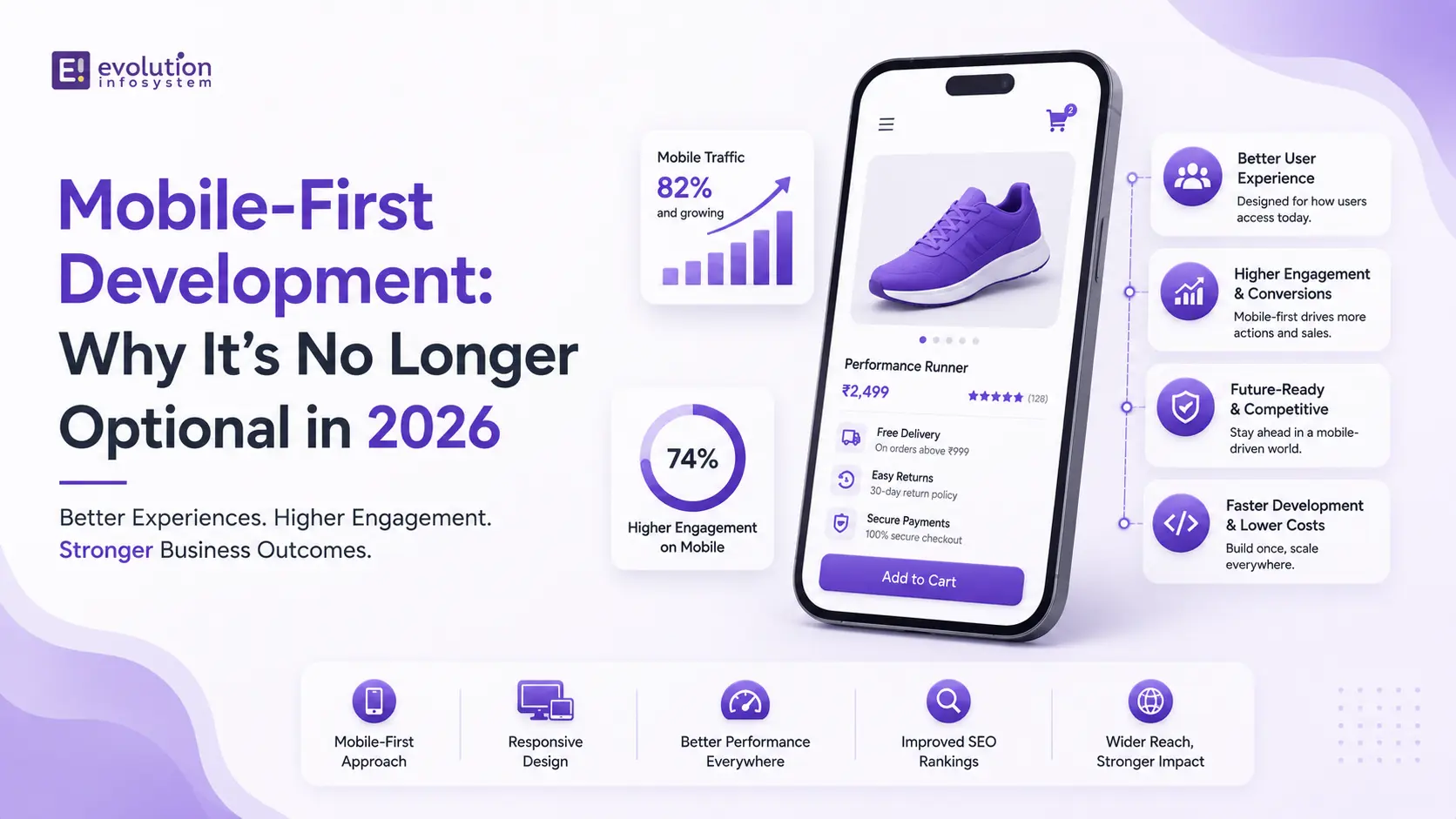
More than 60% of all global web traffic comes from mobile devices. In some markets – India, Southeast Asia, Sub-Saharan Africa – that figure is above 75%. Google has indexed the mobile version of websites as the primary version since 2019 and has run exclusively on mobile-first indexing since 2024.
The data has been clear for years. Yet, a significant number of websites and web applications are still built desktop-first and adapted for mobile as an afterthought – with consequences that show up directly in search rankings, user engagement, and conversion rates.
Mobile-first development is not a trend or a best practice. It is the correct starting point for building anything on the web. Here’s what it actually means, why it matters, and what doing it right looks like in practice.
Mobile-First vs. Responsive: Not the Same Thing
The most common misconception about mobile-first development is that it’s the same as responsive design. It isn’t.
Responsive design means a website adapts to different screen sizes – typically starting from a desktop layout and scaling down using CSS breakpoints. The design thinking starts at desktop, and mobile is an adaptation.
Mobile-first development inverts this. Design and development start from the smallest screen and scale up. The constraints of a 375px mobile viewport – limited screen real estate, touch interaction, variable connectivity, one-handed use – become the design foundation. The desktop experience is an enhancement of the mobile experience, not the other way around.
This distinction matters for two reasons. First, CSS performance: starting from a mobile base and adding complexity for larger screens produces leaner, faster CSS than starting from a desktop base and overriding it for mobile. Second, design thinking: mobile-first forces decisions about content hierarchy and user flow that are obscured when you start with the luxury of a large screen.
Why Google Makes It Non-Negotiable
Google’s mobile-first indexing means that when Google crawls and indexes your website, it uses the mobile version – not the desktop version – as the canonical representation of your content. The mobile version determines your search rankings.
The practical consequences:
If your mobile version has less content than your desktop version – a common artifact of desktop-first development where mobile is treated as a stripped-down secondary experience – Google indexes the lesser content. Your rankings reflect that.
If your mobile experience has poor Core Web Vitals scores – slow LCP, layout shift, poor INP – those scores directly affect your search ranking. Desktop Core Web Vitals scores are secondary.
If your mobile site uses <noindex> directives, blocks resources from Googlebot’s mobile crawler, or has structured data that’s present on desktop but absent on mobile – all of these create indexing problems that desktop-first development commonly produces.
In short: if your mobile experience is an afterthought in development, it becomes an afterthought in search results. There is no workaround for this.
What Mobile-First Development Actually Looks Like
Mobile-first development is a shift in the entire development workflow – not just a CSS approach.
Design begins at 375px. Every layout decision, every content hierarchy choice, every interaction pattern starts from the smallest viewport. Navigation, typography, spacing, button sizes, form inputs – all designed for touch and small screen first. The desktop layout extends from this foundation, gaining columns, sidebars, and additional content as screen real estate allows.
Touch targets meet minimum size requirements. Interactive elements – buttons, links, form inputs – should be at least 44x44px to be reliably tappable without precision. Mobile interfaces where tapping a link requires zooming or multiple attempts have measurably higher exit rates.
Content is prioritized, not preserved. Mobile-first forces hard decisions about what content matters most. The full desktop experience cannot simply be stacked vertically and called a mobile experience. Information hierarchy, progressive disclosure, and the discipline to remove what isn’t essential are core to mobile-first design thinking.
Performance is built in. Mobile users are frequently on connections that are significantly slower than desktop broadband. Mobile-first development treats performance as a design constraint rather than a post-build optimization. Images are sized for mobile by default and enhanced for larger screens. JavaScript bundles are minimized. Above-the-fold content loads fast even on 4G.
Forms are designed for mobile keyboards. Input fields use the correct <type> attribute so mobile keyboards display the appropriate keyboard (numeric for phone numbers, email keyboard for email addresses, date picker for dates). Labels are above inputs, not beside them – beside-label layouts break at narrow widths. Form validation is inline and immediate.
The Performance Standard Mobile-First Demands
Mobile-first development has a performance bar that desktop-first development rarely meets by default:
LCP under 2.5 seconds on a mid-range Android device on a 4G connection. This is Google’s “good” threshold and the standard to design toward. Desktop LCP is almost always better. Mobile LCP is the one that counts.
No cumulative layout shift above 0.1. Layout shift is disproportionately damaging on mobile, where the screen is small and a shifting layout is disorienting. Every image needs explicit dimensions. Every dynamically loaded element needs reserved space.
INP under 200ms. Mobile devices have less processing power than desktops. JavaScript-heavy pages that respond quickly on desktop can have sluggish interaction responsiveness on mobile. Heavy main-thread work, excessive event listeners, and unoptimized third-party scripts all degrade INP on mobile disproportionately.
Testing with realistic mobile conditions – not a desktop browser window resized – is essential. Chrome DevTools’ device simulation and the Lighthouse mobile audit are baseline tools. Real device testing on a mid-range Android device (not a flagship) reveals performance issues that emulation misses.
Mobile-First Beyond the Browser
Mobile-first thinking extends beyond web development to every digital touchpoint:
Email. Over 60% of emails are opened on mobile devices. Emails designed for desktop reading – multi-column layouts, small font sizes, complex image layouts – render poorly on mobile. Email templates designed mobile-first, with single-column layouts and large tap targets, perform significantly better across the full audience.
E-commerce checkout. Mobile checkout abandonment is substantially higher than desktop. The causes are consistent: too many steps, small touch targets, complex form inputs, and slow page loads. Mobile-first checkout design – minimizing steps, using autofill, integrating Apple Pay and Google Pay for one-touch purchase – directly reduces this gap.
Internal tools and B2B applications. The assumption that enterprise and B2B users are always on desktops is no longer accurate. Field teams, sales teams, and executives making decisions while traveling are increasingly completing significant work on mobile devices. Internal tools that work well on mobile are no longer a luxury – they’re a productivity requirement.
Common Mobile-First Mistakes
Testing only on flagship devices. A website that performs well on an iPhone 16 Pro may perform poorly on the mid-range Android devices used by the majority of global mobile users. Test on realistic devices.
Hiding content on mobile instead of prioritizing it. Using <display: none> to hide desktop content on mobile doesn’t solve the mobile experience problem – the hidden content is still downloaded, it just isn’t shown. True mobile-first means making content decisions about what belongs on mobile, not CSS decisions about what to hide.
Neglecting mobile SEO specifics. Structured data, canonical tags, hreflang tags, and metadata should be identical between mobile and desktop versions. Inconsistencies create indexing problems that damage rankings.
Treating mobile navigation as a secondary concern. Navigation on mobile deserves as much design attention as any other element. Hamburger menus poorly implemented, navigation trees too deep for touch, and footer-buried links create orientation problems that desktop navigation never surfaces.
At Evolution Infosystem, every web and mobile project starts mobile-first. It’s the only correct starting point – and the performance and SEO results for clients who have moved from desktop-first to mobile-first approaches reflect that consistently. If your current website or application isn’t mobile-first and you want to understand the impact that’s having on your business, let’s talk.
Frequently Asked Questions (FAQs)
What is mobile-first development?
Mobile-first development means designing and building for the smallest screen first – starting from mobile constraints and scaling up to larger screens. It’s the inverse of responsive design, which starts from desktop and adapts down. Mobile-first produces leaner, faster, more user-appropriate experiences for the majority of web users.
Why is mobile-first development important for SEO?
Google uses mobile-first indexing – the mobile version of your website determines your search rankings. Poor mobile performance scores (Core Web Vitals), less content on mobile than desktop, or mobile-specific technical issues all directly affect rankings. Desktop optimization is secondary.
What is the difference between mobile-first and responsive design?
Responsive design starts from desktop and adapts to smaller screens using CSS breakpoints. Mobile-first starts from the smallest screen and scales up. Both produce websites that work across device sizes – but mobile-first produces better performance on mobile because the design thinking starts from mobile constraints rather than adapting desktop constraints to fit.
How do I test if my website is truly mobile-first?
Run a Lighthouse mobile audit in Chrome DevTools, check your Core Web Vitals in Google Search Console specifically for mobile, test manually on a mid-range Android device (not just a flagship), and use Google’s Mobile-Friendly Test tool. Review your content parity between mobile and desktop – if the mobile version has less content or different structured data, that’s a mobile-first gap.
Evolution Infosystem builds mobile-first websites, web applications, and e-commerce platforms – with performance, SEO, and conversion optimization built in from the start. Contact us to discuss your project.